Optimization
App Store Screenshot Best Practices for Indie iOS Apps
A practical review framework for screenshot order, captions, real UI, localization, readability, and the first three App Store images.
Short answer
Strong App Store screenshots make the product understandable before they make it decorative. Lead with the clearest outcome, keep real UI readable, give every image a distinct job, use short captions, and review the first three screenshots as one sequence.
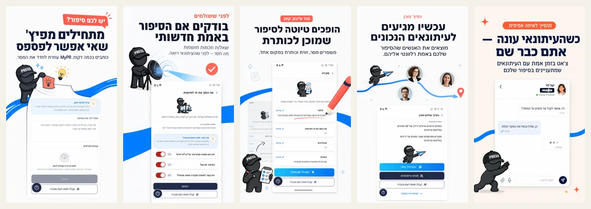
Treat the first three screenshots as one answer
A visitor should understand the app’s category, main outcome, and one reason to believe within the first three images. Apple notes that up to three screenshots may appear in search when no app preview is shown. That makes their order a product decision, not a file-management detail.
- Step 1
Image 1: the outcome
Answer what the app helps the user accomplish. Avoid a logo-only opening panel.
- Step 2
Image 2: the core interaction
Show the real workflow that produces that outcome.
- Step 3
Image 3: the differentiator or proof
Show a credible detail: speed, clarity, automation, insight, or a specialized workflow.
Make real UI the evidence
The screenshot does not need to show every pixel at full scale, but the interface should remain truthful. Do not invent screens, controls, integrations, or states the app does not have. Decoration can create hierarchy; it cannot substitute for product proof.
- Crop around the interaction that supports the caption.
- Keep key labels and controls readable.
- Remove private information and unstable sample content.
- Use a consistent light or dark theme unless the contrast is intentional.
Write captions that survive a small preview
- One idea per caption.
- Lead with a verb or clear outcome.
- Avoid technical terms unless the target buyer uses them.
- Do not repeat the app name in every panel.
- Avoid unsupported superlatives such as “best” or “number one.”
- Translate meaning, not just words, when localizing.
Keep the set cohesive without making every panel identical
Use repeated typography, spacing, and color as the connective tissue. Vary camera angle, crop, depth, supporting illustration, and UI scale only when those changes serve the message. Ten screenshots with the same centered phone and three bullets feel like one idea repeated ten times.
| Panel role | Composition direction | Keep consistent |
|---|---|---|
| Outcome | Large headline with one strong product view | Type, palette, margins |
| Workflow | Two-step crop or connected screens | Caption hierarchy, background |
| Detail | Close crop around one interaction | UI treatment, accent color |
| Breadth | Small grouped views with a clear focal point | Spacing rhythm, labels |
Review against six questions
- Can a new person explain the app after seeing only the first image?
- Do the first three images communicate three different reasons to care?
- Is the important UI readable at a small preview size?
- Does every claim match the shipping product?
- Does the set feel connected without repeating one layout?
- Do the files meet the current Apple requirements?
Sources and verification
Product capabilities and changing requirements were checked against these primary pages. External pages can change after the verified date above.
Related App Store screenshot resources
Try the framework with your own UI
Generate a set, then review it against the checklist in this guide.
Try the framework with your own UI